Data is without a doubt essential for making well-informed business decisions. It has a ton of important information that is just ready to be extracted. It’s no secret, though, that the sheer amount of information produced can be debilitating.
Even if you are successful in finding insightful information, it might be difficult to convey it in a way that is understandable, succinct, and visually appealing. A React Chart library will save the day in this situation.
React chart libraries are useful resources for companies in a variety of sectors who need to turn raw data into relevant insights, make defensible decisions, and effectively convey information to their teams, stakeholders, and clients. These libraries offer the adaptability and interaction necessary to produce interesting and useful data visualizations.
So let’s talk about these priceless tools that can empower you to alter how we view and use data.
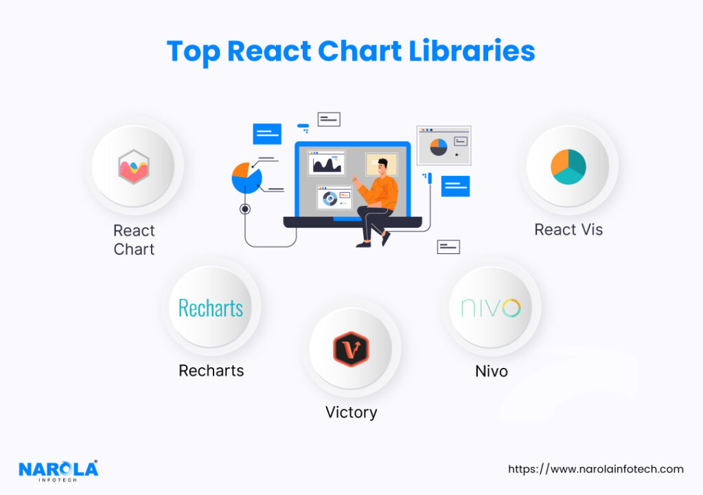
Top React Chart Libraries

1. React Chart
Strong charting library Chart.js is well-known for its adaptability and versatility. It creates new opportunities for dynamic data representation within your applications when used with React. This connection makes sure that a dynamic user interface and a potent data visualization work together seamlessly.
Practical Applications of Chart.js
Financial Performance Monitoring
You are aware of how crucial it is to keep a careful check on your financial situation as a business owner. You may easily transform unprocessed financial data into insightful information with Chart.js.
Pie charts can be used to break down your costs and show you how your resources are distributed visually. The ability to compare revenues over several quarters with dynamic bar charts, on the other hand, allows you to spot revenue trends and possible areas for improvement.
Website Traffic and User Engagement
Chart.js is your ally if you want to make sure that your website not only draws visitors but also keeps them interested. You may get a bird’s-eye perspective of your website traffic, including page views, unique visitors, and bounce rates, through simple line charts. This indicates that you have the ability to identify user behavior trends.
A high bounce rate on particular pages is a clue that they can benefit from optimization. On the other hand, highly engaging sites can act as a guide for developing content that connects with your audience. In short, Chart.js gives you the power to optimize your content strategy for the most impact.
2. Recharts
React, a well-liked JavaScript library for creating user interfaces, and Recharts, a potent charting package, were created with each other in mind. Recharts is unique in that you can make visually attractive charts with just a few lines of code thanks to its user-friendly declarative API.
Due to its simplicity, it may be used by developers of all skill levels and saves time.
Practical Applications of Rechart
Sales Performance Analysis
Rechart gives you the ability to clearly depict revenue trends over time. This makes it easier to spot patterns quickly, identify development possibilities, and ultimately direct your company toward long-term success.
Customer Feedback Analysis
A pie chart that makes use of Recharts gives a clear and succinct summary of emotion. This not only helps you save time but also offers priceless information for improving your goods and services. A better degree of client satisfaction is fostered by this level of detail, which guarantees that your offers are precisely in line with their expectations.
3. Victory
Victory is a superb charting toolkit with seamless React integration that offers a plethora of capabilities to up your data visualization game. You’re doing more than just including charts in your React applications when you use Victory. By improving the way you convey critical business information, you’re increasing the impact and accessibility of decisions based on data.
Any firm trying to succeed in today’s data-centric environment must have access to this degree of sophisticated data visualization.
Here’s a closer look at what Victory brings to the table for business owners like you.
Practical Applications of Victory
Resource Allocation in Project Management
Consider having a clear understanding of the project landscape, such as a map that displays tasks, deadlines, and resources.
Victory adds it to your project management.
Check out who is doing what when. Follow up on progress, make sure deadlines are reached, and reallocate resources as necessary. You may compare it to a GPS for your projects.
Victory also has you covered in terms of timing. Visualize the beginning, end, and important junctures. By doing so, you can maintain consensus and create reasonable expectations.
Market Research Data Presentation
Let’s say you’ve recently finished a thorough market analysis and have a wealth of information, including demographic information and survey results. You must now communicate this to your audience in a way that will keep them interested.
In this situation, you should go with Victory.
For each data point, a variety of chart types are available. You name it: bar charts, line graphs, scatter plots. Victory makes sure that your information comes across in a compelling way. There is a story there waiting to be told; it’s not just numbers.
4. Nivo
In your web applications, Nivo’s robust and flexible data visualization toolkit for React produces beautiful charts and graphs. It offers a wide variety of customisable chart elements, from straightforward bar charts to intricate heatmaps and treemaps.
With its clear API and comprehensive documentation, you can easily incorporate it into your React projects and get all the help you require.
You may use Nivo to transform your data into insightful visual storytelling, giving you the power to decide wisely and communicate findings effectively.
Practical Applications of Nivo
Product Performance Evaluation
You may easily compare the performance of several items using Nivo’s robust charts. Everything will be spelled out, including which goods are flying off the shelves and which could use more encouragement.
Stackable area charts offer a deeper examination, while grouping bar charts enable quick analyses. You can recognize your stars, evaluate stock levels, and come to wise conclusions about your marketing and production tactics. Nivo allows you to manage your items while also improving their performance.
Financial Data Visualization
You can use Nivo to transform those income statements and balance sheets into powerful visual tools. It’s comparable to translating complicated financial data into a universally accessible story.
Nivo’s flexible chart kinds are fantastic. They turn data into insights, bringing clarity to your financial communication. Both you and your consumers will like the simplicity and transparency. Win-win situation. By using Nivo, you can tell an engaging financial story in addition to simply displaying data.
5. React Vis
React Vis is a potent visualization framework that is made to connect effortlessly with React, making it a useful tool for companies like yours.
The adaptability and extensive selection of visualization components make this package unique. React Vis offers the tools to make your data engaging, whether you’re working with intricate financial data, monitoring user activity on your website, or assessing the performance of your products.
Practical Applications of React Vis
Operational Efficiency Monitoring
Heatmaps are a useful feature provided by React Vis. These graphic representations are excellent at conveying intricate operational data in a simple and understandable way.
With its assistance, you can quickly track production downtime. You can quickly spot periods of inefficiency thanks to color coding, which enables you to identify the root causes. React Vis heatmaps highlight areas that need attention, such as supply chain bottlenecks or problems with resource allocation.
Additionally, a heatmap may clearly indicate the allocation patterns for resource usage. You can then optimize your allocation tactics because this gives you a clear picture of resource consumption.
The effectiveness of the supply chain is subject to the same rule. You may optimize processes and improve overall efficiency by visualizing the flow of items and locating possible bottlenecks. React Vis essentially gives you the ability to monitor operations while also making data-driven decisions to cut expenses and streamline workflows.
Risk Assessment and Mitigation
Risk analysis is a crucial step in the strategic decision-making process for enterprises. Radar charts from React Vis provide a dynamic tool for evaluating hazards across many dimensions. Different facets of your business are represented by each dimension. Financial risk, market volatility, regulatory compliance, and other elements may be included in this.
You may map these threats on the radar chart, giving you a complete picture of your risk environment. By prioritizing mitigation actions, risks can be visualized in this way.
For instance, if financial risk is determined to be a high priority issue, you might commit resources to risk-hedging measures or the implementation of strong financial controls. The elegance of radar charts rests in their capacity to reduce intricate risk evaluations to a simple visual representation.
This works as a strong communication tool in addition to helping with decision-making. Discussions about mitigation methods become more focused and fruitful when stakeholders can visualize the risk landscape.
React Vis essentially gives you the tools you need to confront risks head-on, protecting your commercial interests and ensuring long-term success.
Facilitate Decision-Making with the Right React Chart Library
It is clear that these React Chart frameworks have the power to completely change the way you work with data. They serve as the link between unprocessed data and useful insights, ensuring that your decision-making is both well-informed and empowered.
Being able to swiftly understand and convey important information is crucial in the fast-paced commercial environment, where every second counts. You are given this power via React Chart Libraries, which operate as a driver of development and innovation.
Source: React Chart Library

