As you navigate the supermarket aisles, pasta packaging sits like a silent salesman, its design whispering tales of culture and creativity. You’re drawn to the vivid colors and intricate patterns that speak volumes about the regional traditions and symbolism behind each brand.
The artistry on these boxes isn’t just about catching your eye; it’s a delicate dance between cultural heritage and modern design principles. You’ll notice how local flavors and ingredients take center stage, often celebrated on the packaging itself, while color psychology subtly nods to the pasta’s origins.
And as you become more eco-conscious, you’ll see how cultural trends influence the shift towards sustainable packaging. This intersection of culture and design shapes not just what’s on the shelf, but what ends up in your pantry.
Key Takeaways
- Cultural preferences play a significant role in shaping pasta packaging, including factors such as traditional food habits, aesthetic preferences, color symbolism, packaging size and shape, as well as language and labeling.
- Design considerations for pasta packaging include visual appeal, functional aspects, material selection, brand identity, and shelf presence, all of which contribute to the overall packaging design.
- The role of design in pasta packaging is crucial in differentiating from competitors, communicating product attributes, enhancing brand recognition, creating emotional connections with consumers, and influencing purchase decisions.
- Future trends in pasta packaging include the adoption of sustainable packaging solutions, customization and personalization options, interactive packaging experiences, integration of technology, and the development of packaging specifically for e-commerce channels.
Regional Pasta Traditions Through Traditional Packaging
You’ll find that each of the numerous pasta shapes originating from different Italian regions has its own traditional packaging style influenced by local customs and practicality. This regionalization of pasta packaging isn’t merely a marketing strategy but a reflection of historical and cultural identity.
Consider how the robust, thick pastas of Southern Italy are often sold in clear plastic bags, showcasing their hearty shapes and aligning with the region’s straightforward approach to cuisine.
Conversely, Northern Italy, recognized for more delicate shapes like tortellini, frequently utilizes boxes that protect the pasta’s intricate forms. This not only serves a practical purpose but also conveys the finesse and sophistication associated with Northern Italian gastronomy. The packaging is thus an extension of the pasta’s narrative, embedding cultural significance within its design.
Analyzing these choices through a scholarly lens, it’s evident that pasta packaging acts as a cultural signifier. The materials, shapes, and graphics are carefully selected to resonate with the consumer’s sense of regional pride and authenticity.
As you delve deeper, you’ll notice that these design choices aren’t arbitrary. Instead, they’re deeply rooted in a historical context that values provenance as much as the culinary experience itself.
Symbolism in Pasta Packaging Art
While you examine the artwork adorning pasta packages, it’s clear that every image and color choice is imbued with symbolic meaning, reflecting the region’s heritage and culinary stories. The intricate designs often draw from a tapestry of historical and cultural references, serving not only as a feast for the eyes but also as a narrative device.
You’ll notice that traditional symbols, such as wheat sheaves or olive branches, aren’t merely decorative. They’re emblematic of the ingredients’ provenance and the agrarian roots of pasta-making.
The color palette, too, is far from arbitrary. The rich reds and vibrant greens frequently featured echo the Italian flag, evoking a sense of national pride and authenticity. These hues also allude to classic ingredients like tomatoes and basil, reinforcing the connection between the product and its traditional uses.
Analyzing the typography, you discern another layer of symbolism. Flowing scripts suggest artisanal craftsmanship, while bold, modern fonts may imply a contemporary take on classic flavors. Each typographic choice communicates a different brand story, one that’s carefully curated to resonate with consumers’ aspirations and palates.
In essence, pasta packaging is a canvas where cultural identity, culinary tradition, and marketing acumen converge, creating a visual language that speaks volumes to discerning shoppers.
Pasta Packaging Color Psychology and Heritage
Building on the symbolism in packaging art, you can’t overlook how color psychology deeply intertwines with cultural heritage to influence pasta packaging design. Colors aren’t merely aesthetic choices; they’re a lexicon of cultural signifiers, shaping consumer perceptions and choices.
In the context of pasta, a quintessential Italian staple, packaging colors often hark back to Italian flag colors or the rustic hues of the Italian countryside, aiming to evoke authenticity and tradition.
Here are three fundamental ways in which color psychology and heritage mold pasta boxes:
-
Cultural Resonance: Certain colors resonate with cultural identity, like green, white, and red reflecting Italian national pride. This subliminal messaging fosters a connection with the product’s origins.
-
Emotional Response: Colors trigger emotional responses; warm tones such as red and yellow can stimulate appetite and convey warmth, aligning with the hearty, comforting nature of pasta meals.
-
Brand Differentiation: By employing distinctive color palettes, brands position themselves uniquely in the market. Heritage colors might be used to emphasize artisanal quality, while modern, vibrant colors could suggest innovative flavors or contemporary appeal.
Understanding these dynamics, you can see that color choices in pasta packaging are far from arbitrary. They’re calculated decisions that draw on cultural narratives and psychological triggers to communicate with and entice the consumer.
Local Ingredients Showcase In Pasta Packaging
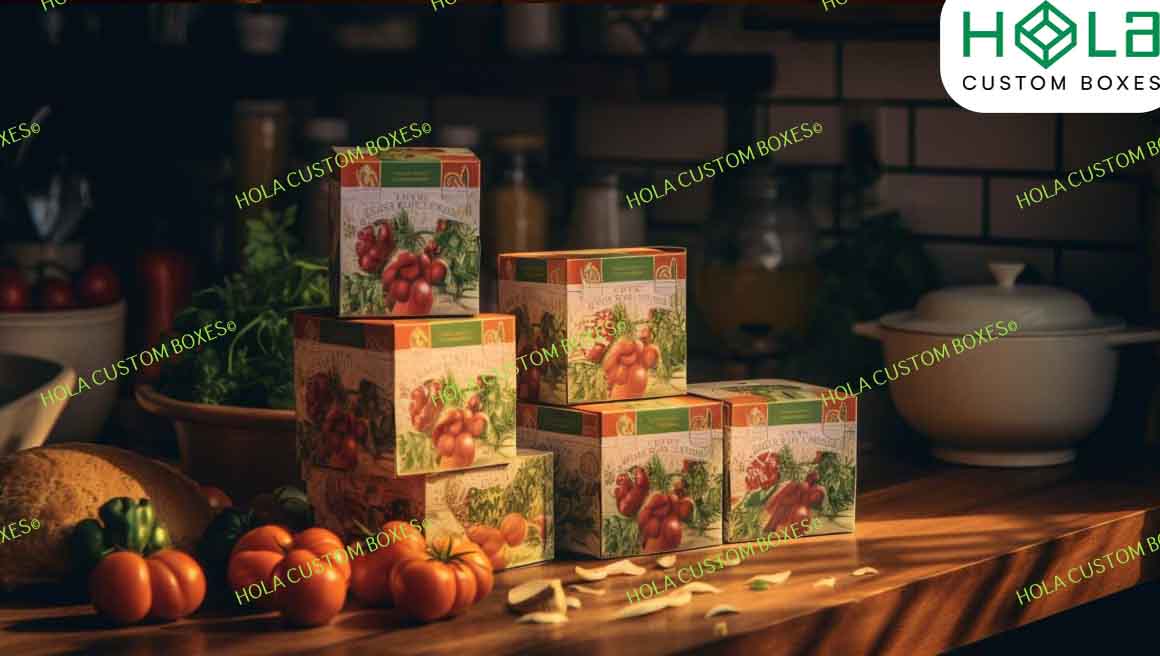
Why not let the local flavors take the spotlight on your pasta packaging, highlighting the region’s specialties and the authenticity of the ingredients? This approach not only taps into the consumer’s desire for transparency but also celebrates the cultural identity embedded within the culinary arts. Featuring local ingredients can serve as a testament to the product’s provenance and quality, which is particularly appealing in an era where traceability and origin are highly valued.
Analyzing this from a design perspective, the use of visual cues such as illustrations or photographs of local herbs, grains, or landscapes can create a narrative that resonates with both local consumers and those seeking an authentic experience from afar. Scholarly research suggests that such authenticity in packaging design can significantly influence purchasing decisions, as it fosters a connection between the consumer, the product, and its origins. The narrative woven through the visual storytelling of local ingredients can be both a differentiator and a declaration of cultural pride.
As we delve into the intricate interplay between cultural representation and design, it’s essential to consider how these elements align with broader societal values, such as sustainability. This naturally leads us to explore eco-conscious cultural trends, which are increasingly shaping packaging design in the food industry.
Eco-Conscious Cultural Trends Of Pasta Packaging Boxes
You often see pasta packaging that not only reflects cultural identity but also embraces eco-friendly practices, as sustainability becomes an ever-present value in our society. The intersection of cultural trends and environmental concerns is increasingly visible in the way pasta is packaged. Manufacturers aren’t simply selling a product; they’re communicating a narrative that aligns with the ethos of eco-conscious consumers.
Here’s an analytical breakdown of the trends:
-
Biodegradable Materials: Companies are opting for materials like plant-based plastics and biodegradable paper, which decompose naturally, reducing landfill waste. This shift is a response to a growing cultural movement that prioritizes the health of the planet.
-
Minimalist Design: A less-is-more approach in packaging design reduces the use of inks and dyes, which can be harmful to the environment. This trend reflects a cultural embrace of simplicity and authenticity, values that resonate with consumers seeking a more sustainable lifestyle.
-
Reusable Containers: Some brands have introduced packaging that serves a secondary purpose or can be repurposed, encouraging consumers to reduce waste. This innovation reflects a cultural trend towards sustainability that extends beyond the point of sale.
Conclusion
You’ve seen how pasta packaging isn’t just about containing the product, but a canvas where culture and design intertwine.
Regional traditions, symbolic art, and color psychology reflect a deep heritage, while showcasing local ingredients underlines authenticity.
Moreover, the shift towards eco-conscious packaging mirrors a cultural evolution towards sustainability.
In essence, every design choice is a nod to cultural identity, consumer psychology, and environmental responsibility – a true testament to the confluence of culture and design in guiding packaging aesthetics.