In the dynamic retail realm, competition thrives, and choices abound; businesses seek innovative strategies to capture potential buyers’ attention and shape on the purchasing choices of retail packaging.
A strategy that has gained substantial traction is leveraging color psychology in retail packaging. The nuanced yet potent influence of colors on consumer behavior is profound and should not be underestimated.
As experts in captivating content creation, we delve deep into the world of color psychology in retail boxes to unravel strategic insights that captivate consumers and drive conversions.
Unveiling Emotional Triggers: The Color Spectrum
Colors transcend visual stimuli; they evoke emotions, memories, and associations deeply ingrained within the human psyche. By understanding the psychological triggers associated with various colors.
Businesses can wield them to convey brand messages and influence consumer perceptions. Let’s explore some key colors and their psychological implications in retail packaging:
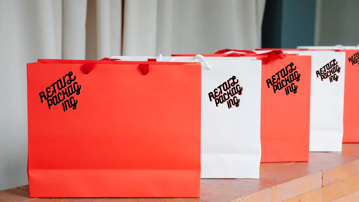
Vibrant Red: Passion and Urgency
The color red exudes energy, passion, and urgency. It commands attention and ignites excitement. Brands looking to infuse urgency into their packaging, such as limited-time offers or sales, can strategically integrate red to prompt swift action from consumers.
However, a balanced approach is crucial, as excessive use of red might induce an alarming response.
Tranquil Blue: Trust and Serenity
Blue symbolizes calmness and trust. Brands aiming to position themselves as trustworthy can opt for shades of blue in their packaging.
This color is particularly effective in industries where a sense of security and tranquility is paramount, such as finance or healthcare.
Energetic Yellow: Positivity and Optimism
Yellow radiates warmth, happiness, and optimism. It creates an Inviting and joyful experience for consumers, making them more receptive to brand messages. However, moderation is vital, as excessive use of yellow might lead to visual strain.
Earthy Green: Growth and Harmony
Green, associated with nature, growth, and health, signifies eco-friendliness and sustainability.
Brands focused on organic or natural products can employ green to communicate their values and resonate with environmentally-conscious consumers.
Luxurious Black: Sophistication and Elegance
Black conveys sophistication, elegance, and luxury. Brands targeting the higher end of the market can utilize black to communicate exclusivity and timeless appeal.
Nevertheless, the overuse of black may evoke a somber tone that could deter some consumers.
Crafting a Strategic Color Palette
While individual colors hold psychological significance, the real art lies in harmoniously blending them to create a compelling color palette.
A well-crafted palette captures attention and tells a story that aligns with the brand’s ethos and the target audience’s aspirations.
In the competitive retail landscape, differentiation is the key to success. A distinctive color palette can become a brand’s signature. For instance, the iconic red and white combination Coca-Cola uses is globally recognizable.
The vivid red catches the eye, while the white background imparts purity and simplicity, establishing an enduring connection with consumers.
The Power of Color Placement
Color placement within packaging design also profoundly influences consumer perception. Brands often capitalize on the “von Restorff effect,” where an element standing out from its surroundings is more memorable.
Skillfully incorporating a bold splash of color amidst a muted background creates a lasting impression.
Moreover, a color used in typography and call-to-action night cloaked deck buttons guides consumers’ eyes to essential packaging elements, encouraging desired actions like purchasing, visiting a website, or sharing on social media.
Adapting to Evolving Trends
As consumer preferences and trends evolve, so must the use of color psychology in retail packaging. Brands must remain attuned to cultural shifts, societal changes, and emerging technologies influencing color perception.
In the digital age, where online shopping prevails, brands must ensure consistent color representation across screens and devices. A cohesive color identity builds brand recognition and consumer trust.
Conclusion
The psychology of colors in custom packaging services wields the potential to sway consumer behavior, evoke emotions, and establish a robust brand identity.
Through a judicious blend of vibrant hues, strategic placement, and deep audience understanding, businesses create packaging that captures attention and resonates emotionally.
As experts in crafting captivating content, we recognize the pivotal role in boosting online visibility. Our exploration of color psychology in retail packaging underscores our commitment to delivering insightful content that empowers businesses to thrive in the competitive digital landscape.